
How technology is redefining MRV in blue carbon
The drone component of the Apolownia MRV platform is live
Our drone-to-MRV workflow is now in operational use on the BlueRizon project. Here is what happens between a drone flight and a restoration decision, and why it changes the way a mangrove project is designed and verified.
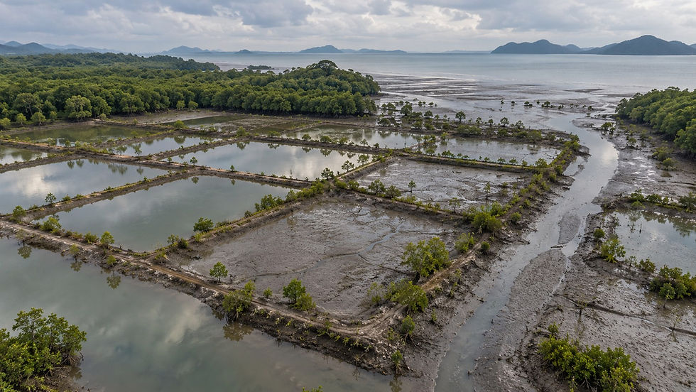
Abandoned aquaculture ponds on a mangrove coast at low tide (illustration).
Whether a mangrove restoration works depends on one simple thing that carbon calculations do not capture: does the tide actually reach the ground where the trees are planted? The abandoned shrimp ponds of the north coast of Java, where BlueRizon works, look flat and uniform from a satellite. On the ground they are a patchwork of dikes, gates, silted canals and basins whose floors sit at slightly different heights. A seedling can thrive on one side of a dike and drown, or dry out, thirty metres away. Good monitoring therefore starts before planting, with an accurate picture of the site itself.
1. What photogrammetry is, and why the drone matters
Photogrammetry means measuring the real world from photographs. A drone flies back and forth over the site in straight lines and takes hundreds of vertical photographs that overlap heavily, so that every point on the ground appears in several pictures taken from slightly different angles. Just as our two eyes give us depth, software compares these pictures, works out exactly where each one was taken from and reconstructs the position and height of millions of ground points. Two products come out of it: a height map of the site, and an orthophoto, a single seamless image corrected so that it can be measured like a map.
The quality of that reconstruction is decided in the air. We use a professional mapping drone, the DJI Matrice 4E, flown at 100 to 120 metres, camera pointing straight down, with 80 per cent overlap between successive photographs and 70 per cent between flight lines. At that height each pixel covers three to five centimetres of ground, small enough to see a sluice gate, a breach in a dike or a single young tree. The first flight over Bungko (Cirebon, West Java) in May 2026 covered 138 hectares, 154 ponds and 32 kilometres of dikes in one mission. A small consumer drone flown lower reaches a similar pixel size; the difference is elsewhere: in how precisely each photo is positioned, in a camera built for survey work, and in the ability to fly the same regular grid over hundreds of hectares, today and again next year. The small drone is fine for a quick look; the baseline is frozen with the mapping drone. What goes into the processing chain decides the quality of everything that comes out of it.
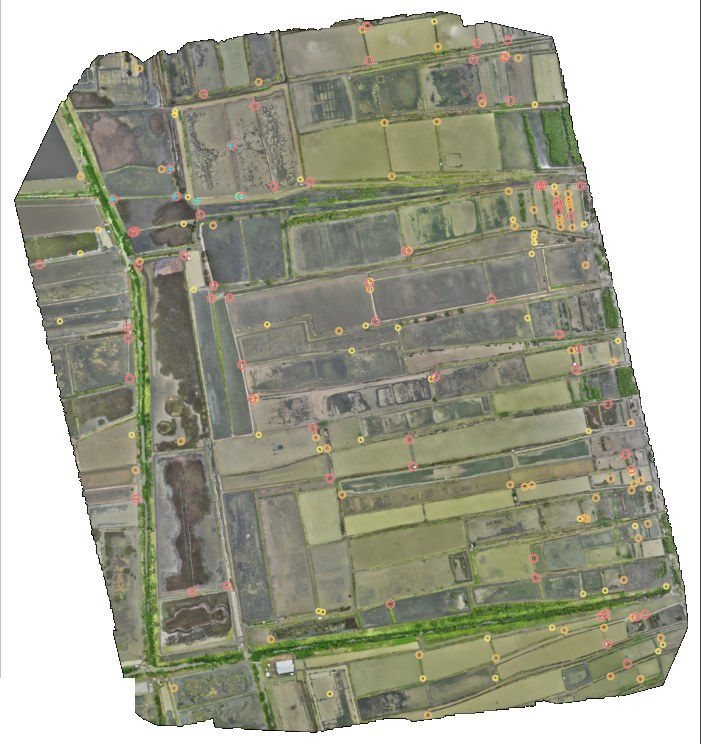
Figure 1. Bungko, Cirebon, May 2026: the orthophoto of the whole 138-hectare flight at 5 cm per pixel. Each circle is an opening detected between two ponds (a gate, a breach or a low dike), ranked by confidence; 65 of them are rated highly probable, with a measured precision of 89 per cent.
2. From the flight to the analysis
A flight is only the first step, and each step has its own difficulty. The first is volume. One mapping campaign produces tens of gigabytes of raw imagery, far too much to move casually between the field, the cloud and the GIS team. The Bungko flight returned 640 photographs, of which 237 were kept for processing; assembling them into an orthophoto took about an hour and a half, and because the software handles only a few dozen hectares at a time, a large site is cut into several jobs and stitched back together. The result must be an orthophoto a GIS can really use: correctly positioned on the map, seamless, and with consistent colours from one end of the site to the other, not simply a nice picture.
The second difficulty is turning pixels into objects. Our processing chain first tells ponds from canals by their shape, compact rectangles against long thin lines. It then walks along the edge of every pond looking for anything that differs from the rest of the same dike: a sluice, a breach, a low section that goes under water at high tide. A model trained on 226 examples annotated from this very flight ranks each candidate by confidence, and the ranking is honest with itself: the openings rated highly probable turned out to be real 89 per cent of the time, and the less certain ones are flagged for a field check. The height map is corrected with 660 water surfaces used as a spirit level, the flight is placed on the tide curve so we know how high the water was at that moment, and vegetation is mapped from the images. Every polygon of the project then receives its own diagnosis.
This is where artificial intelligence has changed our work. The detection of gates and breaches relies on a model trained on examples annotated by our own team, and the GIS analyses that follow, from the network of canals to the path of the water into each basin, the correction of the relief, the tidal reading and the diagnosis of every polygon, are run by AI agents that chain the analyses, check them against one another and write the site sheet. That is how analyses of this depth can be produced for every flight, with the same method every time, across more than a thousand kilometres of coastline. The agents decide nothing on their own: their results are ranked by confidence, labelled observed or inferred, and validated by our scientists and in the field. The AI does the heavy lifting; people keep the judgement.
The third difficulty is trust. Each flight produces a dated site sheet that says plainly what was seen, what was deduced, and what still has to be checked on the ground. The whole chain is versioned and can be rerun from the raw photographs, and the baseline files are fingerprinted, so that an auditor can reopen exactly the evidence we used. We are also careful about heights: without RTK positioning or ground control points, a flight gives heights relative to the water surface at the time of the flight, not heights above sea level. That is enough to measure a dike, a pond depth or the step between two basins; comparing heights between flights years apart needs corrected positioning, which is the standard we are moving to.
3. What it changes for a mangrove restoration
Mangroves live by elevation. On the north coast of Java the tide only rises and falls by about half a metre, so a pond floor twenty centimetres higher than its neighbour is flooded every day or only at spring tides, drains in hours or stays waterlogged for days, and each case suits a different species, or none. We therefore classify the intertidal zone in elevation bands a few tens of centimetres wide, each with its own planting rule: Rhizophora on the planting levels of sheltered ponds, Avicennia in the low band and on flooded floors, Bruguiera and Ceriops on the high band. Small relief also decides whether nature does the work for us: on Kangean, the 30 to 80 centimetre ridges of spoil along dug channels trap floating propagules and regenerate on their own, while the flat, compacted floors of old ponds do not. From a satellite these differences are invisible; at five centimetres they are the map.
Hydrology and tidal connection become measurable. The same flight tells us which channel is connected to the sea, which canals the water reaches, how many dikes it must cross to get to each basin, and which basins are effectively cut off. At Bungko, for one five-hectare polygon, the model estimates that 46 per cent of the floor sat below the level of its feeding canal at the time of the flight, rising to 58 per cent at the next high tide and 74 per cent at spring tides if the gate is reopened. That is a design decision taken before planting: which gate to repair, which dike to open, where planting is pointless without earthworks, and which species goes where.

Figure 2. The same flight read two ways. Left: where the water comes from. Dark blue is the channel connected to the sea, cyan the canals reached by water, and each pond is coloured by the number of dikes seawater has to cross to reach it (green: opens directly onto a canal; yellow: one dike; orange: two; red: three or more). Right: relative relief from the drone height map, from the water surface at the time of flight (blue) to the top of the dikes (white); the dikes stand 0.5 to 1.5 metres above the water and not all pond floors sit at the same level.
The starting point is known tree by tree. Satellite data had flagged three Bungko polygons as possibly regrowing naturally. The five-centimetre orthophoto showed no woody vegetation inside the ponds: the signal came from trees on the dikes, mixed pixels and algae. The pre-planting baseline could therefore be frozen with confidence, polygon by polygon. Under VM0033, the Verra methodology BlueRizon follows, the carbon that is credited is measured in the field on permanent sample plots; drone and satellite images do not replace that work, they show where to measure, what was there at the start, and whether what was planned is what was built. Repeat flights on the same grid will then track what follows: the planted rows and the gaps in them, erosion, damaged structures, and any difference between the plan and the ground.
Used this way, monitoring does not simply document a project after the fact; it shapes how the project is designed, implemented and checked. Every product is dated, versioned and reproducible, which is what an auditor, an investor or a corporate buyer needs in order to trust a tonne of blue carbon.
The drone component of the Apolownia MRV platform is now in operational use on BlueRizon. It feeds the environment where satellite, drone and field data are brought together, and where AI agents turn them into the maps, diagnoses and alerts that project teams use to map, analyse, compare and monitor project areas over time, from the first feasibility screen to long-term monitoring. With the drone workflow, we have moved from developing tools to using them on our projects, and drone coverage of the Year-1 polygons is programmed accordingly.
Apolownia develops high-integrity blue carbon projects, restoring mangrove ecosystems that remove carbon while protecting coastlines and communities.


Comments